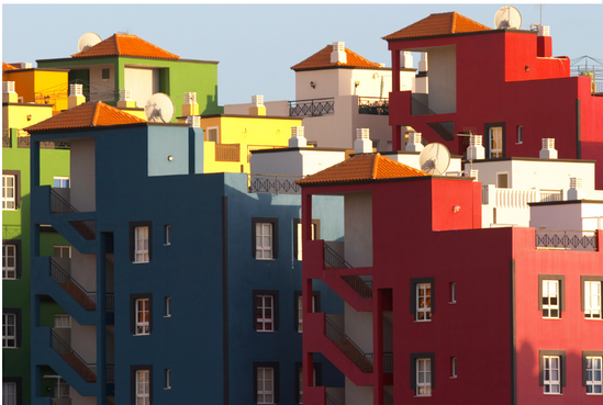
 The exterior of your home or business is the first thing that visitors see and should have a welcoming appearance. With a professional exterior paint job you can create an aesthetically pleasing house or office that creates a first impression that speaks volumes about you and/or your business. The goal of color design in an architectural space is not for decoration alone. Humans react to color in very profound ways and make subconscious decisions based on experiences with color and the physiological responses in the body. For example studies have shown red stimulates our appetite and increases our blood pressure while blue suppresses the appetite and lowers our blood pressure. We are also conditioned by nature and our environment. Take yellow and black, the colors of pedestrian crossing and other warning signs as well as police tape- which are meant to alert us to potential danger. This same color scheme is used for bulldozers and more than one brand of drills and tools- thus making it a powerful, more masculine color scheme. Yet, used individually, yellow and black take on very different meanings and reactions. Such as cheerfulness for yellow and sophistication for black. For graphic designers, advertisers, architects, decorators and color consultants, choosing color is vital to achieving a desired outcome. Colors do create an atmosphere, a mood and influence buyers. The right exterior colors in commercial projects can:
The right exterior colors in residential projects can:
Tips for using exterior color:
If you need help with choosing colors or any painting projects, give us a call and we’ll get it done right the first time.
26 Comments
Our client loved her oak cabinets, tan colored tiles and dark Formica counter top-15 years ago. But like many of our clients she was ready for an update to brighten up her space. 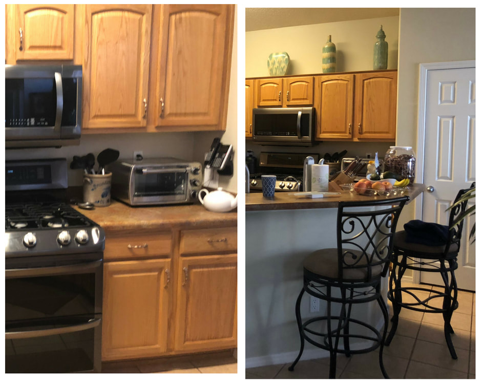 Before I worked with the client, visiting tile and kitchen stores in person and online to find the simple, white (vanilla) quartz countertop, the multi-gray backsplash, the cabinet pulls, and the wood look tile. Paint colors were chosen making sure the undertones worked perfectly. PaintSmith, Steve and his team worked his magic and painted the cabinets with Benjamin Moore Advance Satin -color match to Sherwin Williams Alabaster White. Agreeable Gray, a warm gray, was chosen for the walls. 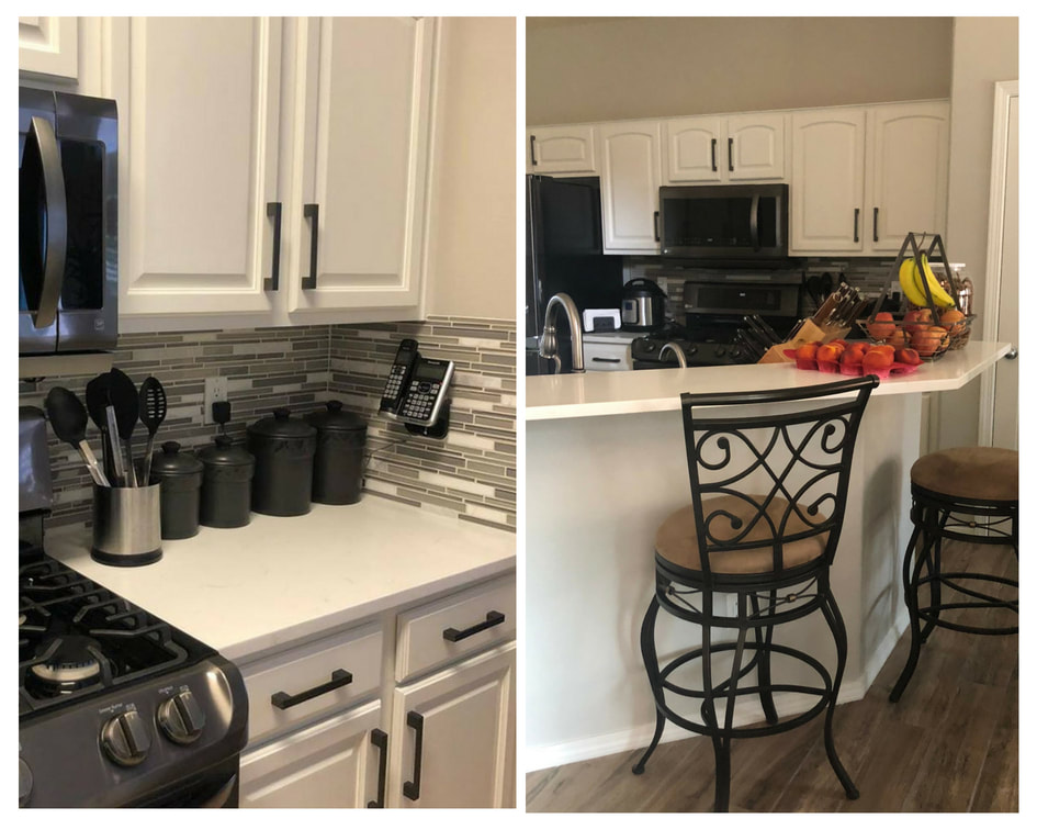 After If your kitchen or bath is ready for an update, let us help you from start to finish with your project.
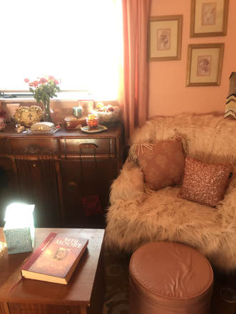
Color Consulting Redesign Painting Color and room layout can have a profound effect on your mood, your energy level and your overall life experience. How do you choose your perfect color palette? While every color consult we do is a little different, here are 5 common things most people don't give enough consideration to when they are choosing colors. 1. Color Psychology - Think about places you spend a lot of time like your office, your favorite restaurant, your friends home, your home, your gym. What kind of feelings or energy level do you experience? Now think about the surroundings, light, color, furniture. Can you sense a connection between the color and how it affects you? Does it feel cozy? Relaxing? Stimulating? Does it make you feel calm? Productive? Creative? Powerful? Talkative? Sleepy? Energetic? And it's not just about moods or feelings, it's physical too. Studies show that blue can actually lower your blood pressure while red increases it. The place to start with color psychology is to ask yourself what is the purpose of the room? Once you have determined that, you can begin to narrow your color choices down. (Even if you are painting a neutral white, gray, tan or beige, you'll still have plenty of color uses through your accessories.) Here are some colors and the possible effects to them: Black White Red Blue Green Yellow Purple Brown Orange Pink Next ask yourself if there are there any colors you hate? Blue can create a spa like feeling in your master suite, but if you hate the color blue or associate it with bad memories, clearly it will not affect you in a positive way! Don't choose by the color name. Names can be very deceiving. Here is an example of a color consultation I did for a couple who had chosen their own gray but once the color stared going on the wall it turned a blueish gray which was not at all what they had in mind. To get the color they wanted, I chose a color named Accessible Beige. As you can see this greige appears totally gray on their walls! With beige in the name this wouldn't have been a color they would have chosen and they would have missed out on exactly what they wanted.  2. Temperature & Undertones- This is a big one that can make or break your look. Your first step is determining if your fixed elements (flooring, counter tops, etc.) are warm or cool. You will want to stay in the same temperature in order to have the most harmonious look. Using this photo again as an example, you'll see the flooring, the wood furniture and the rug are all warm undertones, which is why the original gray they chose didn’t work. It was a cool gray with cool undertones. So although you may think gray is a cool color, like all colors it has a warmer version and a cooler version. You may gravitate towards a cool gray but if your fixed elements are warm, you should opt for a warm gray. The fact that all colors have warm or cool versions is good news because you can still incorporate your favorite color into your palette by choosing the right temperature. For example if these homeowners wanted a blue rug instead of the red, they would just need to choose a warm blue and it'd be gorgeous!
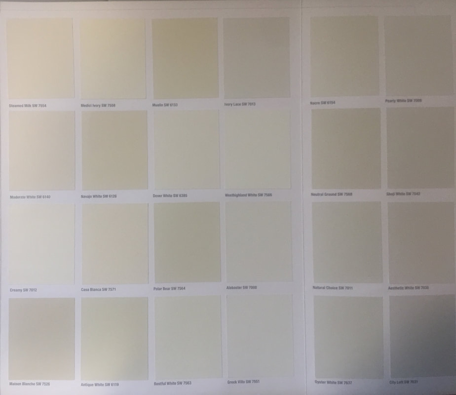
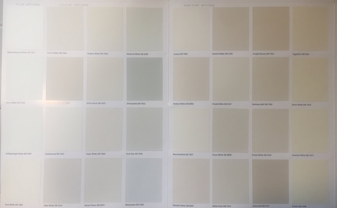
3. Are you painting the ceiling too? Don't assume that your white ceiling doesn't have an undertone. Many times it appears to be pure white but in reality it has a red, yellow, blue or green undertone that isn't apparent until you paint the walls a new color. Case in point- I had a client who wanted to change their light mocha colored walls to a light gold. Because the walls were mocha, the white of the ceiling appeared white. However, when I held up the 8x11 light gold color chip next to the ceiling, the red undertone was apparent and looked slighty pink. So although the ceiling paint was in really good condition and repainting was going to increase her cost, she wanted the new color so I chose Navajo White which has a yellow undertone (which like the red is indiscernible) and looks just like white on the ceiling. 4. LRV- Light Reflective Value is how much light reflects or absorbs. In other words how dark or how light a room will appear. What kind of look are you trying to achieve? Light, bright and airy? Or dark, cozy and dramatic? The LVR number is 0% for the absolutist blackest and 100% for the lightest white. Most people prefer a color somewhere in the 45-55% range. However, you'll want to take into consideration how much light you get in your room. If it’s a dark room to begin with you may want to go as little lighter and lower on the LRV scale to get the color you really want. Or if the room is already very bright, you would be safe to go a little higher on the LRV scale. 5. Lastly, do what you like! You are the one who will be living or working in your space so if something makes you feel good but doesn't follow the "rules" go ahead and be a rebel! Like life, you will be more satisfied if you are surrounded by what makes your heart sing and have flow, harmony and purpose. If you are still unsure about choosing colors and want to avoid costly mistakes, contact us to schedule a color consultation! White doesn't have to be boring! On the contrary, many decorators, artists and homeowners use white as their primary palette to create a blank canvas so their own style and colors can take center stage. The challenge for most people is how to choose the perfect one. All paint colors (including white) have a primary undertone-yellow, red, green or blue. These 2 photos are the whites available from Sherwin Williams. Looking at them on this card you may think they look like pastels as opposed to white. But when they go up on the wall they WILL look white- only the subtlety of the undertone will be apparent in relation to your fixed elements such as flooring and furniture. Which is why it's crucial to choose the right white based on your lighting and fixed elements as it can make or break your entire look. Here are a sampling of some of the whites we've worked with. 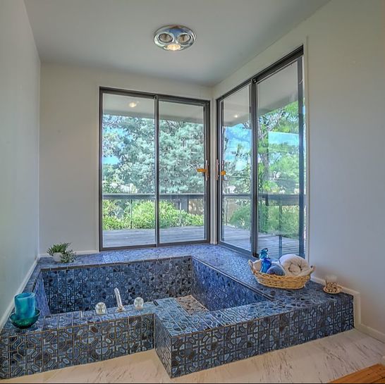 Alabaster White  Snowbound  White Duck with Snowbound Trim and Doors  Natural Choice 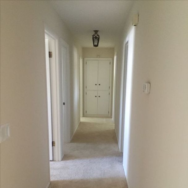 Moderate White with Snowbound Doors and Trim 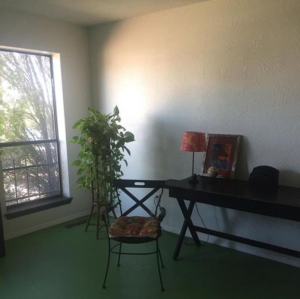 Alabaster White
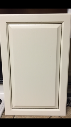
Nothing can make or break your kitchen quite like the cabinets. Many people don't realize that it doesn't have to cost a fortune. By using paint you can update and refresh your cabinets for a fraction of what replacing them would cost. Below are a variety of some of the cabinet work we have done. 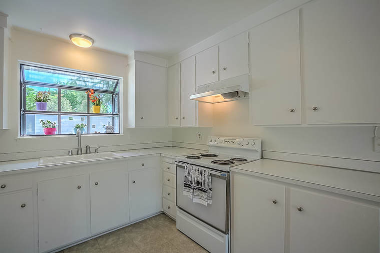 Classic white cabinets in this 1960's home for sale gave a crisp and clean look. This was part of a complete repaint that led to a fast sell for this homeowner who got their asking price. 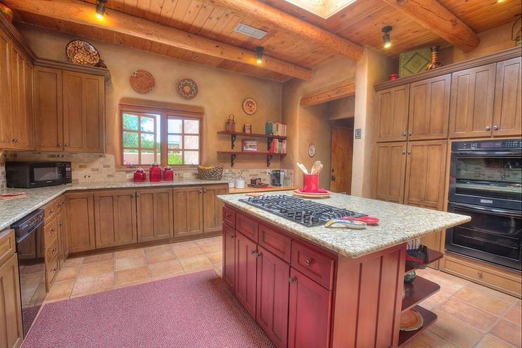 Originally all of these cabinets were painted a terracotta color. This homeowner wanted a change so the main cabinets were painted a brown color, antiqued with a glaze and finished with a clear coat. The island was painted a southwestern red, glazed and finished with a clear coat. 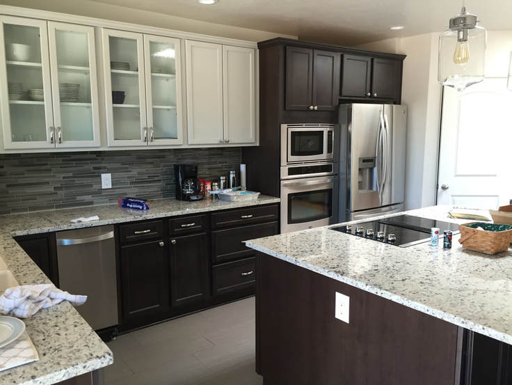 Two toned cabinets are an exciting way to update your kitchen. These cabinets were painted white and an espresso brown.

It's the busy season for buying and selling real estate which also means it's a busy season for color consultants and painters preparing houses. Homeowners and realtors alike recognize the value of investing in a professional paint job.
Kim Travascio, Qualifying Broker with Heart Homes, LLC explains, "When clients narrow their home search down, they are going to choose the home that they feel most comfortable in and can visualize living in. A fresh paint job can be the deciding factor for that."
Here is what we think you should know from the professionals about painting before you sell.
The top 3 reasons you should paint:
Top 3 paint tips to getting a return on your investment:
Tanya Otero-Villalobos, Associate Broker, Buyer's Agent for Keller Williams says, "I often see home buyers struggle with the aesthetics of what could be a great home. Specifically paint...they see dingy worn walls or colors that are not pleasing to them and sometimes cannot get past it. I counsel them on what a fresh coat of paint can do to change the overall feeling and make a house, their home. We let sellers know the importance of painting prior to putting their house on the market. Which quite simply, with a nice neutral coat of paint on the walls, can lend to the overall appeal and to a much quicker sale of the house." Whether you are a buyer, a seller, or a realtor, we are happy to talk to you about your painting and color needs to make that house a dream home!
Because we are fully repainting the kitchen (inside and outside of cabinets, walls, ceilings, doors, trim and baseboard) I had to go through Every. Single. Thing. in my kitchen. This sounds like a chore but after all these years with a red kitchen I was up for the challenge and for purging, quickly and decisively! I made 4 categories- selling, keeping, donating and trashing. Here are some of my highlights in these categories:
I'm not exaggerating when I tell you how energized I have been the past couple of days as I watch the progress take place in my kitchen. All the hard, but satisfying decluttering work is done, my color palette is coming to life and all that is left for me to do when the crew finishes the painting is to put minimal stuff away, decorate and redesign my "new" kitchen. You too can experience this fresh start! Just don't wait 11 years like I did. Not only because you definitely need to declutter before then, but painting is best done every 5 years to keep the walls looking fresh and updated. If you are ready we are here to help with painting, color consulting and redesign services. I promise the calm, clear motivation that you'll find is worth your investment. Besides choosing your painter and choosing your colors there is one other consideration that plays an important role in how happy you will be with your paint job. That one thing is sheen.
Here are some guidelines: Flat or Matte: The least durable and scrub-able sheen but If you want a saturated, velvety wall, a flat finish will make your heart sing. A favorite among designers and painters for the depth of color, this is not the best choice if you have a high traffic area with kids and animals. A matte or flat finish will also hide drywall imperfections better than any other sheen. Rich. Velvety. Saturated. Depth. Conceals. Eggshell: One step up from a matte finish, eggshell gives good color saturation and still has a soft look but gives you the ability to wash the wall. If you have kids or animals and will be doing a lot of cleaning this is a good choice. It can be used in the kitchen and the bathroom and withstand moisture and frequent cleaning. Much like the sheen of an eggshell (hence the name), the sheen is so subtle that most times you have to look at the wall from an angle to see it. This is also a favorite among designers and painters. An eggshell finish will show slighty more imperfections than a matte or flat. Subtle Sheen. Soft. Saturated. Washable. Satin: This sheen has a shine to it. It is more durable and can stand up to more traffic and scrubbing. Satin can be used on walls throughout the house, though most frequently in kitchens and baths because of the moisture since satin and higher sheen paints resist moisture far better than paints with less sheen. There was a time that satin was the lowest sheen used when you wanted durability. (However, if you have your heart set on the more velvety, soft finish, there are products out there that will give you the wash-ability option in a matte or eggshell finish.) Due to its durability and scrub-ability and because it will hide more imperfections than semi-gloss, I specify satin for doors, trim and baseboards in homes, especially if we are re-painting trim or doors that have been painted before. Light Reflective. Durable. High-Traffic. Scrub-able. Gloss: This is the most durable and scrub-able paint sheen. It is also the most reflective which means it will highlight and show every little imperfection. This should be used on walls or ceilings only if you have a level 5 drywall finish. (A Level 5 finish is perfectly smooth-the highest degree of quality in drywall finishing). Under the right conditions it can be beautiful. A high-sheen paint reflects light, much like a mirror, making the color seem more vivid and bright. Durable. Scrub-able. Vivid. Bright. Highlights. Reflective.
So what sheen should you use? Here are my preferences: Walls: Flat, matte or eggshell throughout house. Eggshell in bathrooms or kitchens. Ceilings: Always flat or matte. (Unless in the kitchen or bathroom.) Anything higher than matte will show imperfections. A shiny ceiling can be beautiful but only if you have a level 5 finish. Side note: You may sometimes see track homes that definitely do not have a level 5 finish and yet the ceilings have a shine to them. This is not something they have done with design in mind; instead this is done because it is more cost effective for the builder to have the painter do the same sheen on both the walls, the ceiling, the doors and the trim. It takes less prep, less time and therefore keeps the costs down. Trim, baseboard, doors: Satin for residential, semi-gloss for commercial. It is easily cleaned and the light reflectiveness of these sheen's highlight the architectural details. One last thing to note, sheen are not universally exact. Each paint manufacturers differ so be sure to check with your local paint store as you decide what to use. Whether you are choosing colors or choosing sheen, keep in mind the most important rule; you will be the one living with it, so choose what makes you happy! If you would like our professional opinion, give me a call. It happens every time I meet with a client. Invariably during the process of color selection the client wants to know what the name of the color is. I get it. I do the same with nail polish. Who wouldn’t with the great names OPI gives it colors? (I’m currently wearing You Can Count on It.) But when choosing colors for your home or office you could potentially overlook the perfect color just because of the name. 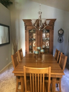 For example, this client wanted to brighten up her dining room from the deep, dramatic olive green she had enjoyed for the last few years. She wanted something lighter, brighter, perhaps blue, but didn't want a pastel or baby color. We wanted to create a sophisticated, inviting look in this dining room while accentuating her accessories. The home is an open floor plan so the dining room can be seen from most of the living areas. That made it even more important for the flow that we choose a color that harmonizes with all the rooms while still accomplishing the look she desires. She also gets great sunlight in the afternoon from the west window in the room so the room does tend to appear much warmer during the most used times. For this room I specified a bluish gray that in most lighting appears to be blue. The name of the color? Aloof Gray from Sherwin Williams. The name gray could have been a turnoff for lighter and brighter and she may not even considered it if we were looking at color names, but it was perfect. It had a sophisticated blue nuance and she loves it!
|
Author
Jennifer Smith is a Certified Architectural Color Consultant in Albuquerque, NM. Archives
November 2023
Categories
|
 RSS Feed