|
Color and room layout can have a profound effect on your mood, your energy level and your overall life experience. How do you choose your perfect color palette? While every color consult we do is a little different, here are 5 common things most people don't give enough consideration to when they are choosing colors. 1. Color Psychology - Think about places you spend a lot of time like your office, your favorite restaurant, your friends home, your home, your gym. What kind of feelings or energy level do you experience? Now think about the surroundings, light, color, furniture. Can you sense a connection between the color and how it affects you? Does it feel cozy? Relaxing? Stimulating? Does it make you feel calm? Productive? Creative? Powerful? Talkative? Sleepy? Energetic? And it's not just about moods or feelings, it's physical too. Studies show that blue can actually lower your blood pressure while red increases it. The place to start with color psychology is to ask yourself what is the purpose of the room? Once you have determined that, you can begin to narrow your color choices down. (Even if you are painting a neutral white, gray, tan or beige, you'll still have plenty of color uses through your accessories.) Here are some colors and the possible effects to them: Black White Red Blue Green Yellow Purple Brown Orange Pink Next ask yourself if there are there any colors you hate? Blue can create a spa like feeling in your master suite, but if you hate the color blue or associate it with bad memories, clearly it will not affect you in a positive way! Don't choose by the color name. Names can be very deceiving. Here is an example of a color consultation I did for a couple who had chosen their own gray but once the color stared going on the wall it turned a blueish gray which was not at all what they had in mind. To get the color they wanted, I chose a color named Accessible Beige. As you can see this greige appears totally gray on their walls! With beige in the name this wouldn't have been a color they would have chosen and they would have missed out on exactly what they wanted. 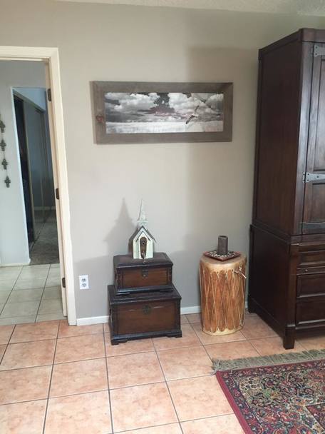 2. Temperature & Undertones- This is a big one that can make or break your look. Your first step is determining if your fixed elements (flooring, counter tops, etc.) are warm or cool. You will want to stay in the same temperature in order to have the most harmonious look. Using this photo again as an example, you'll see the flooring, the wood furniture and the rug are all warm undertones, which is why the original gray they chose didn’t work. It was a cool gray with cool undertones. So although you may think gray is a cool color, like all colors it has a warmer version and a cooler version. You may gravitate towards a cool gray but if your fixed elements are warm, you should opt for a warm gray. The fact that all colors have warm or cool versions is good news because you can still incorporate your favorite color into your palette by choosing the right temperature. For example if these homeowners wanted a blue rug instead of the red, they would just need to choose a warm blue and it'd be gorgeous!
3. Are you painting the ceiling too? Don't assume that your white ceiling doesn't have an undertone. Many times it appears to be pure white but in reality it has a red, yellow, blue or green undertone that isn't apparent until you paint the walls a new color. Case in point- I had a client who wanted to change their light mocha colored walls to a light gold. Because the walls were mocha, the white of the ceiling appeared white. However, when I held up the 8x11 light gold color chip next to the ceiling, the red undertone was apparent and looked slighty pink. So although the ceiling paint was in really good condition and repainting was going to increase her cost, she wanted the new color so I chose Navajo White which has a yellow undertone (which like the red is indiscernible) and looks just like white on the ceiling. 4. LRV- Light Reflective Value is how much light reflects or absorbs. In other words how dark or how light a room will appear. What kind of look are you trying to achieve? Light, bright and airy? Or dark, cozy and dramatic? The LVR number is 0% for the absolutist blackest and 100% for the lightest white. Most people prefer a color somewhere in the 45-55% range. However, you'll want to take into consideration how much light you get in your room. If it’s a dark room to begin with you may want to go as little lighter and lower on the LRV scale to get the color you really want. Or if the room is already very bright, you would be safe to go a little higher on the LRV scale. 5. Lastly, do what you like! You are the one who will be living or working in your space so if something makes you feel good but doesn't follow the "rules" go ahead and be a rebel! Like life, you will be more satisfied if you are surrounded by what makes your heart sing and have flow, harmony and purpose. If you are still unsure about choosing colors and want to avoid costly mistakes, contact us to schedule a color consultation!
7 Comments
9/12/2022 11:57:22 am
nice tips on selecting paint colors. I love how you put color psychology as the top consideration, too. 8/5/2023 07:22:30 am
You are an awesome writer. I am grateful for this content. Please call us if you are looking for painting company near me in Mount Pleasant. Always nice to read this kind of post. 8/18/2023 10:09:02 pm
I am loving the tips here. Thank you! Leave a Reply. |
Author
Jennifer Smith is a Certified Architectural Color Consultant in Albuquerque, NM. Archives
November 2023
Categories
|
 RSS Feed