|
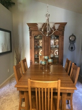
It happens every time I meet with a client. Invariably during the process of color selection the client wants to know what the name of the color is. I get it. I do the same with nail polish. Who wouldn’t with the great names OPI gives it colors? (I’m currently wearing You Can Count on It.) But when choosing colors for your home or office you could potentially overlook the perfect color just because of the name.  For example, this client wanted to brighten up her dining room from the deep, dramatic olive green she had enjoyed for the last few years. She wanted something lighter, brighter, perhaps blue, but didn't want a pastel or baby color. We wanted to create a sophisticated, inviting look in this dining room while accentuating her accessories. The home is an open floor plan so the dining room can be seen from most of the living areas. That made it even more important for the flow that we choose a color that harmonizes with all the rooms while still accomplishing the look she desires. She also gets great sunlight in the afternoon from the west window in the room so the room does tend to appear much warmer during the most used times. For this room I specified a bluish gray that in most lighting appears to be blue. The name of the color? Aloof Gray from Sherwin Williams. The name gray could have been a turnoff for lighter and brighter and she may not even considered it if we were looking at color names, but it was perfect. It had a sophisticated blue nuance and she loves it!
7 Comments
|
Author
Jennifer Smith is a Certified Architectural Color Consultant in Albuquerque, NM. Archives
November 2023
Categories
|


 RSS Feed