|
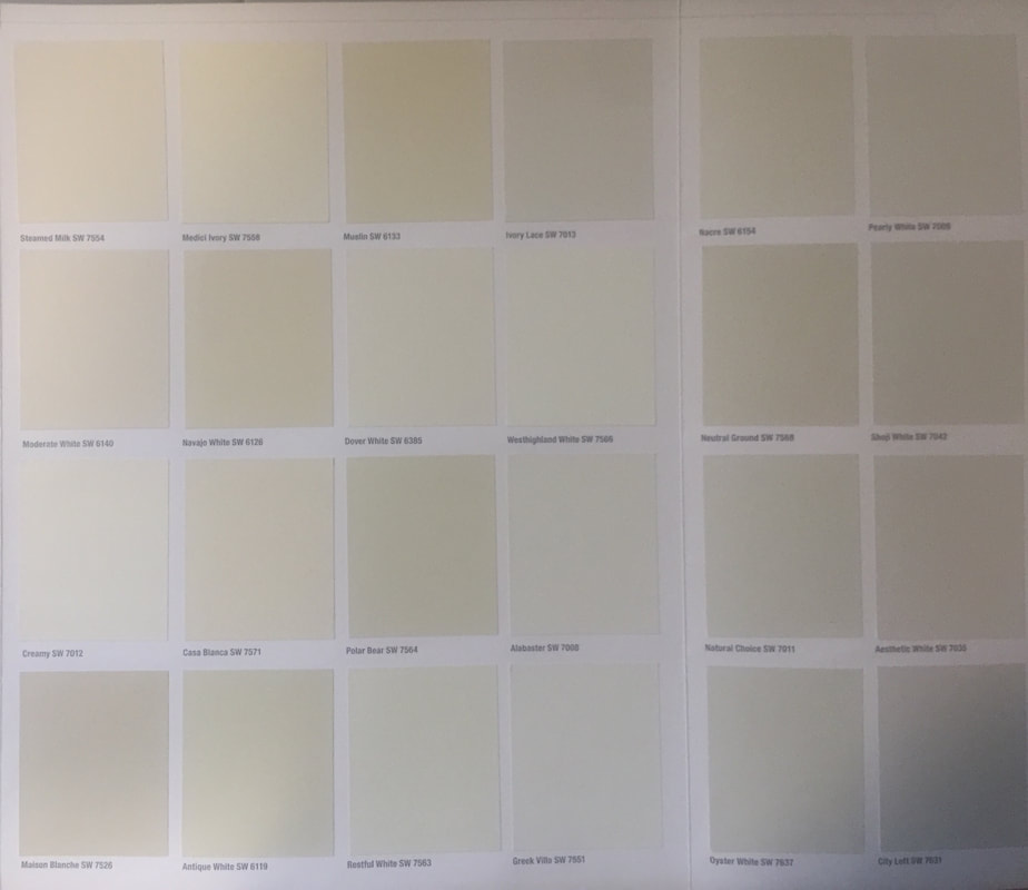
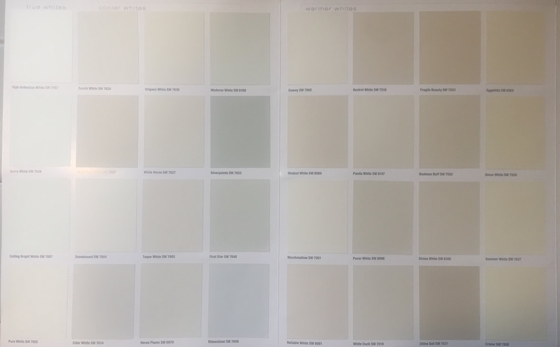
White doesn't have to be boring! On the contrary, many decorators, artists and homeowners use white as their primary palette to create a blank canvas so their own style and colors can take center stage. The challenge for most people is how to choose the perfect one. All paint colors (including white) have a primary undertone-yellow, red, green or blue. These 2 photos are the whites available from Sherwin Williams. Looking at them on this card you may think they look like pastels as opposed to white. But when they go up on the wall they WILL look white- only the subtlety of the undertone will be apparent in relation to your fixed elements such as flooring and furniture. Which is why it's crucial to choose the right white based on your lighting and fixed elements as it can make or break your entire look. Here are a sampling of some of the whites we've worked with. 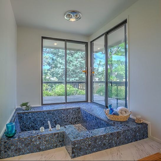 Alabaster White 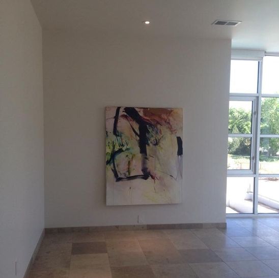 Snowbound 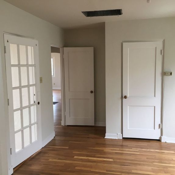 White Duck with Snowbound Trim and Doors 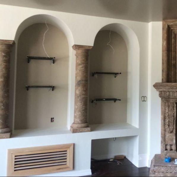 Natural Choice 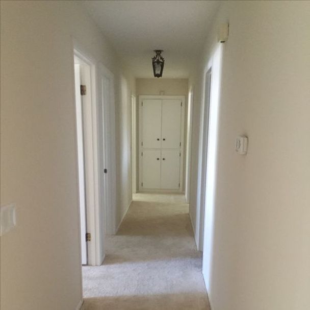 Moderate White with Snowbound Doors and Trim 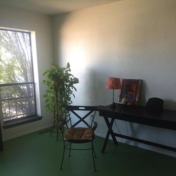 Alabaster White
0 Comments
|
Author
Jennifer Smith is a Certified Architectural Color Consultant in Albuquerque, NM. Archives
November 2023
Categories
|
 RSS Feed