|
Each year my favorite paint companies release their color of the year. I choose paint colors from any manufacturer but my top three are Sherwin Williams, Benjamin Moore, and Dunn Edwards so I am featuring them here. Keep scrolling to see the predictions for 2024. (I hope you like blue!) Sherwin-Williams Upward Used as an accent or all over, in classic coastal or casual Nordic styles, the airy, misty-hued beauty dwells where the fairest-weather blue finds just a hint of silver lining. Additionally, the commercial appeal of pale blue hues resonates widely, manifesting in furniture, lighting, textiles, and accessories in ranges that seamlessly blend aesthetics and functionality. 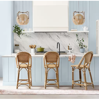 Blue Nova by Benjamin Moore This rich, grounded blue works just as well on an accent piece as it does covering a color-drenched room. The color was chosen to represent the blend of modern and traditional styles that are popular in home interiors right now. “Blue Nova is an alluring mid-tone that balances depth and intrigue with classic appeal and reassurance.” 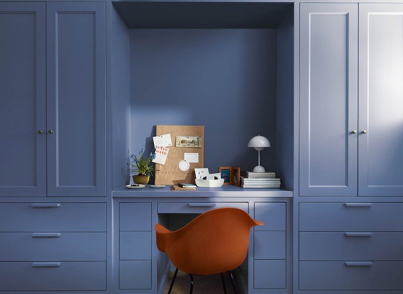 Dunn-Edwards Skipping Stones is a serene and steely blue with hints of green and gray and is meditative and energizing like the sea. As we move into 2024, Skipping Stones lets you capture the feeling of dreamy nostalgia blended with a future of unlimited possibilities. Skipping Stones evokes the meditative tranquility of the sea, inviting us to pause and find moments of stillness in our fast-paced lives. Its calming influence encourages optimism and embodies the essence of coastal serenity. 
0 Comments
Color is a tricky thing. Some people don’t like any color and just like to stick to whites or neutrals. Some people prefer cool colors, while some prefer warm colors. Most people feel comfortable with neutrals and pops of color through their accessories or the aptly placed accent wall or colorful piece. And then you have those bold, artistic people who want lots of color! This fun couple who had just purchased their home in a Del Webb community felt the white cabinets, and the all-white house was too sterile for their liking. The wife shared that this is the last home she will live in, and since she is not concerned with reselling, there is no thought of what someone else may like. She wanted earthy and southwest but didn't want a brown. She opted to paint her cabinets and all her doors and trim in Sherwin Williams Copper Mountain and the walls in shades of aqua and apricot. Jennifer also helped choose her backsplash, hardware, carpet, and window coverings and worked with the other subcontractors while Steve painted the doors and cabinets. We can't wait to see it furnished and the artwork on the walls! Here is what she had to say about Jennifer, "You are a terrific business person - you keep many plates spinning, have great customer service & to top it off, you are immensely creative, direct, & succinct in summarizing where we are in each project. I spent 35 yrs of my life coaching district managers & CEOs how to show up in life like you do." 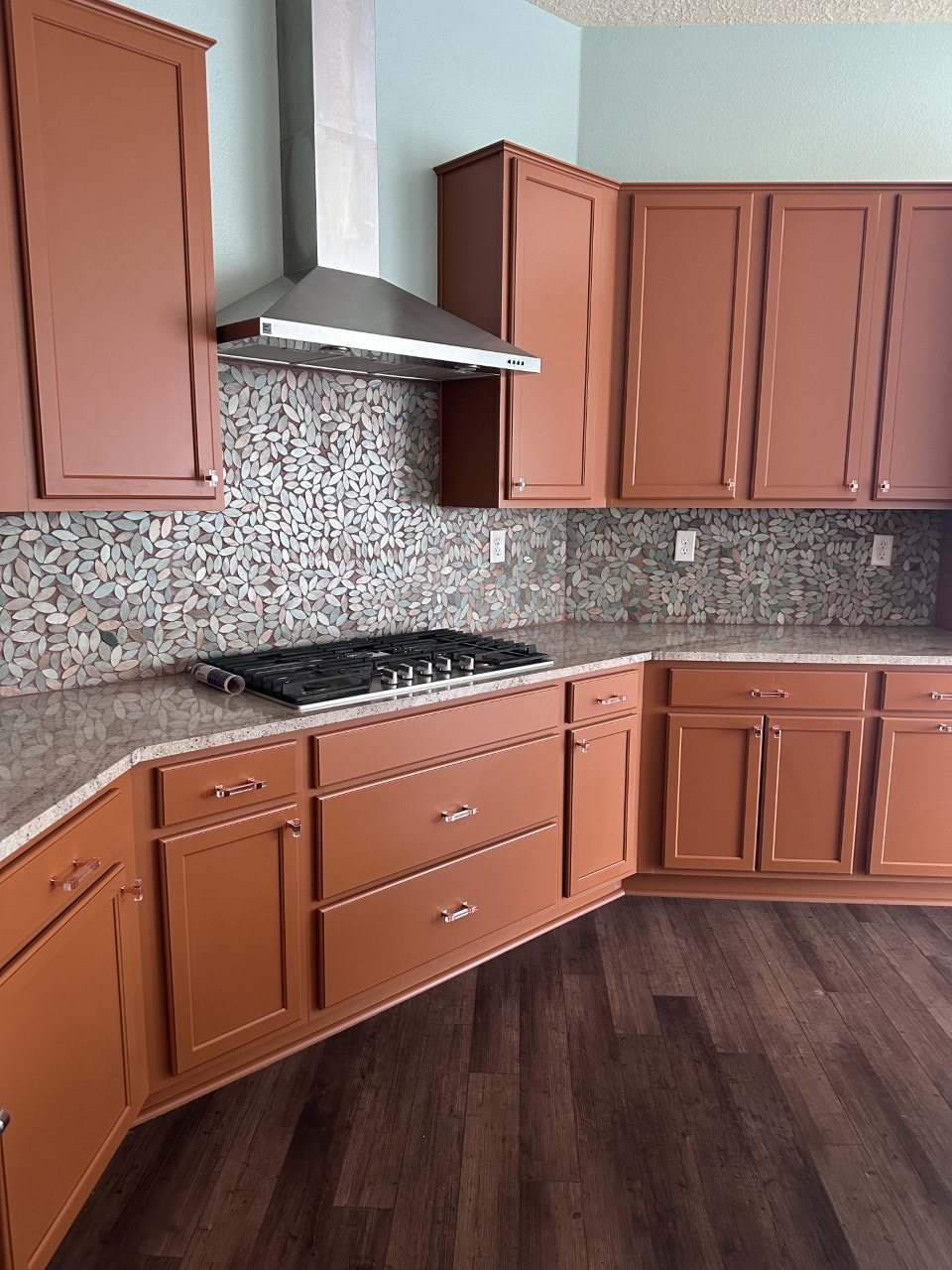 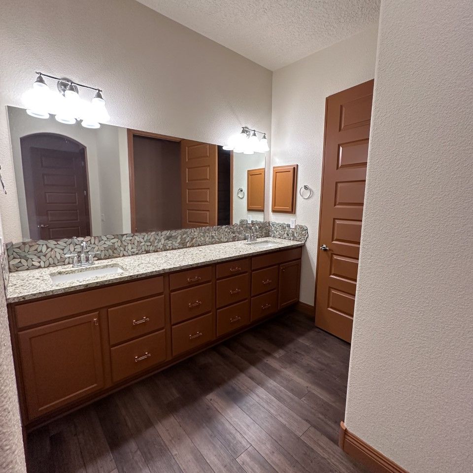 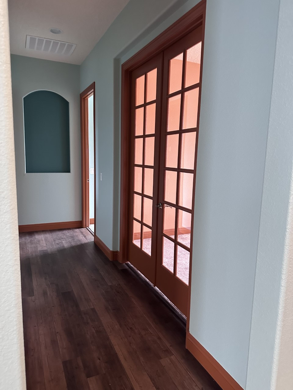 As a realtor and color consultant I constantly observe and critique houses as I walk my neighborhood or as I arrive in any neighborhood to meet clients. I hate to say it but, in my neighborhood alone at least 50% of the houses could have done better choosing their roof or body color. In this blog I share a few of the mistakes I have seen and the remedies.
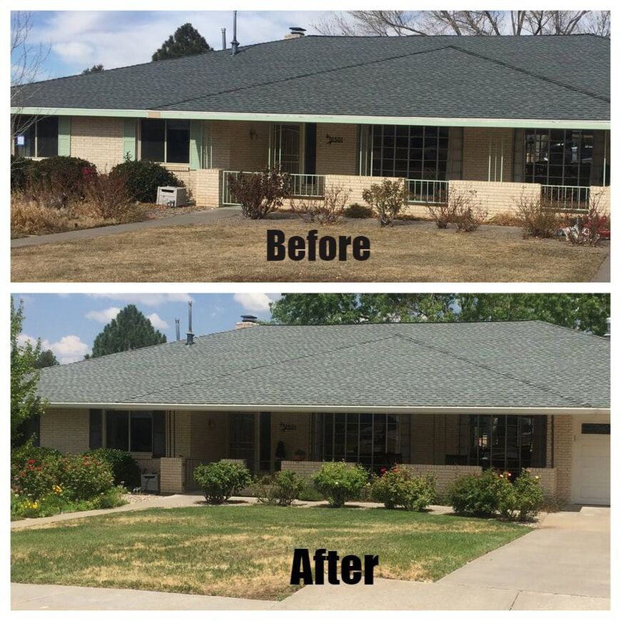 This client called me after purchasing her house. It had a brand-new roof chosen by the previous home owner. Unfortunately, the very visibly large roof with the light-colored brick, trim, garage door, wrought iron, trim and shutters felt like it was weighing down the house. It wasn’t in the budget to repaint the bricks or replace the roof so my suggestion was to add some dark where we could to balance out the weight of the color of the dark roof. Another issue was the light green color on the house was not appealing to the current owner. The Solution:
These next two houses are not my clients but houses I pass by frequently. In my opinion they could be improved by a color change.  2. The Problem: Roof Doesn’t match the House Color This is a definite “don’t do this”. The creamy white/light yellow brick of the house as well as the red shutters are very warm where the roof is a very cool gray. It doesn’t work at all! The Solution: Either choose a new roof color that has warm undertones or repaint the body of the home a cool color. 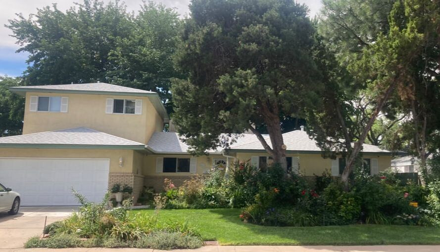 3. The Problem: Roof Doesn’t match the House Color Although it’s not as bad as the previous home, this house that has wonderful curb appeal could be improved by applying the same principle of matching warms with warms and cools with cools. The green and yellow with the very warm bricks works so well in this case I would change the roof color to a warmer tone. 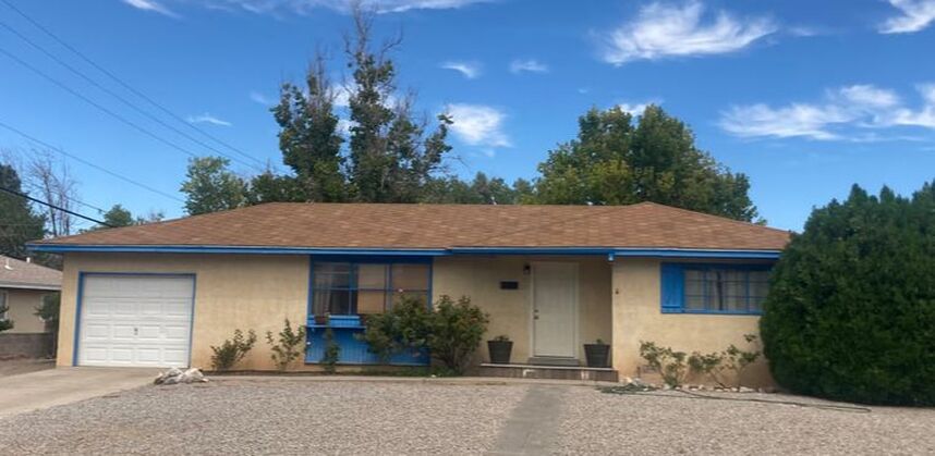 4. The Problem: The Garage Door Color and Garage Door Trim are Accentuating the Smallness of the Garage Door The Solution:
This is a case of color placement as well as the color. This house (also not my client) could make their home more harmonious by not accentuating the one car garage. Whether you like the blue of the trim or not is not the issue. The issue is using the blue trim around the one car garage. When you use a trim color around the garage door that is different from the house color or the garage color you automatically make it appear smaller and bring the eye to it. In this case it’s already small so the goal would be to make it flow and disappear into the body of the house. In order to do that I would:
As always it is my pleasure and passion to help you with your home needs! If you are picking colors, a new roof or wanting to buy or sell a house please give me a call. I am here to serve you! I was recently featured on Redfin offering the same suggestions. Their question to me was "what are the best paint colors for selling a house?" As you probably have gathered from this blog there is much more than just picking a color you like. You have to look at the other colors used already, the landscape, and the architecture before offering an actual color. Although I didn’t offer any color suggestions some others did so take a look. You can read the article here: “The Best Paint Colors for Selling a House in 2021” Redfin blog *Each year our favorite paint companies release their color of the year. Keep scrolling to see the predictions for 2021! Benjamin Moore  Aegean Teal 2136-40 Take a moment to reflect and reset. Intriguing, balanced, and deeply soothing, the Benjamin Moore Color of the Year 2021, Aegean Teal 2136-40, creates natural harmony. Nourish the spirit with the comforting, sunbaked hues of the Color Trends 2021 palette, including Aegean Teal 2136-40. Celebrate the simple pleasures—think the faded rumple of linen sheets in the morning and perfectly ripened fruits on the windowsill. The twelve hues in the palette radiate warmth and wellbeing. These are colors that make your home feel even more like home. Settle in.  Sherwin Williams 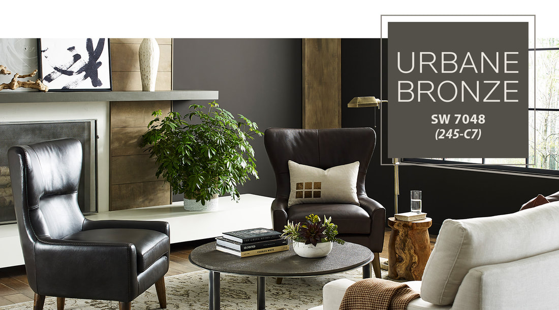 Urbane Bronze SW 7048 Tap into nature with a hue whose warmth and comfort breathe down-to-earth tranquility. The Sherwin Williams 2021 Color of the Year, Urbane Bronze, captures that simple sophistication every space is searching for. Find Your Sanctuary Now more than ever, our homes have become the backdrop to our lives, reminding us that the moments worth cherishing have always been right in front of us. As we're looking to create the ultimate retreat for reflection and renewal, we're turning to a hue whose natural simplicity and nature-inspired energy cultivate a sense of calm from the ground up. Rooted in Nature The trend for biophilia continues to shape our spaces, proving that nature is never far away. Urbane Bronze might be a color rooted in nature, but it also has a unique ability to ground a room through organic appeal. Whether it's accentuating window trims or accent walls, this warm hue draws from nature for a feeling of relaxation and serenity. It also works well with other biophilic elements including, light-filled spaces and foliage. 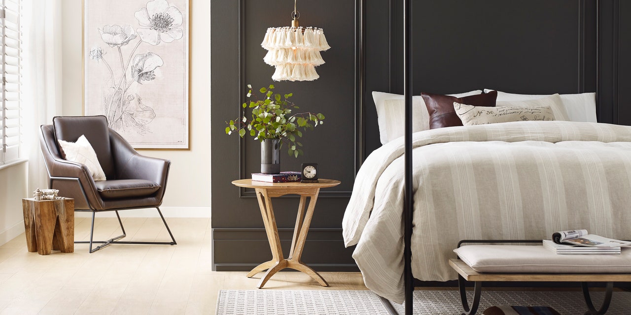 Dunn Edwards  Dunn Edwards October Color of the Month: Rosewine Fall is well on its way come October and as the weather cools, our tastes naturally turn to more saturated, darker tones. Tones that envelop us in their warmth. October’s color of the month Rosewine (DE5019), continues the exploration into fall’s drama and depth, which began last month. As rose blossoms in the garden have given way to darkened rose hips, so too have our sights shifted from pinker hues of summer to velvety plums and reds reminiscent of the season’s impending wine harvest. *All content taken from respective paint companies websites.
Who doesn't love the class and feel of mid-century design? Not only are these houses charming but the construction is solid and they have great mature trees! My friend and colleague just listed this gorgeous home in the NE Heights. I had the honor and fun of doing the colors. This mid-century house was completely remodeled and staged perfectly to get that mid-century modern feel. I'll let the photos do the talking. Sherwin Williams paint colors used include: Wordly Gray, Intellectual Gray, Anonymous, Sensible Hue, Grizzle Gray and Snowbound. ⠀ 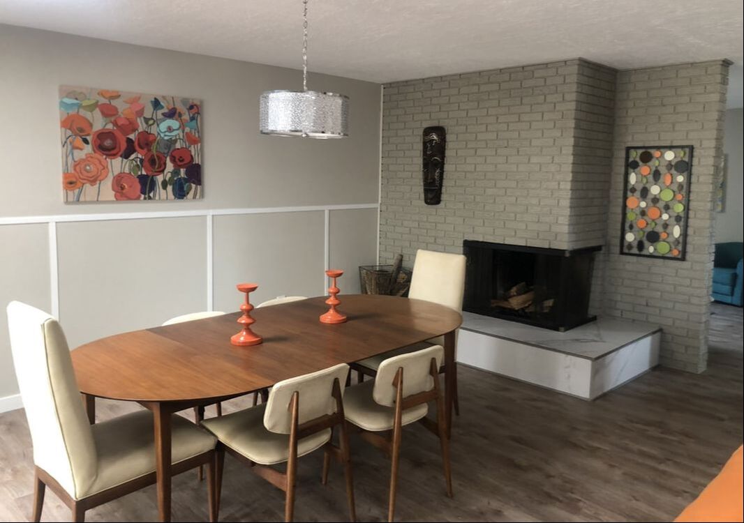 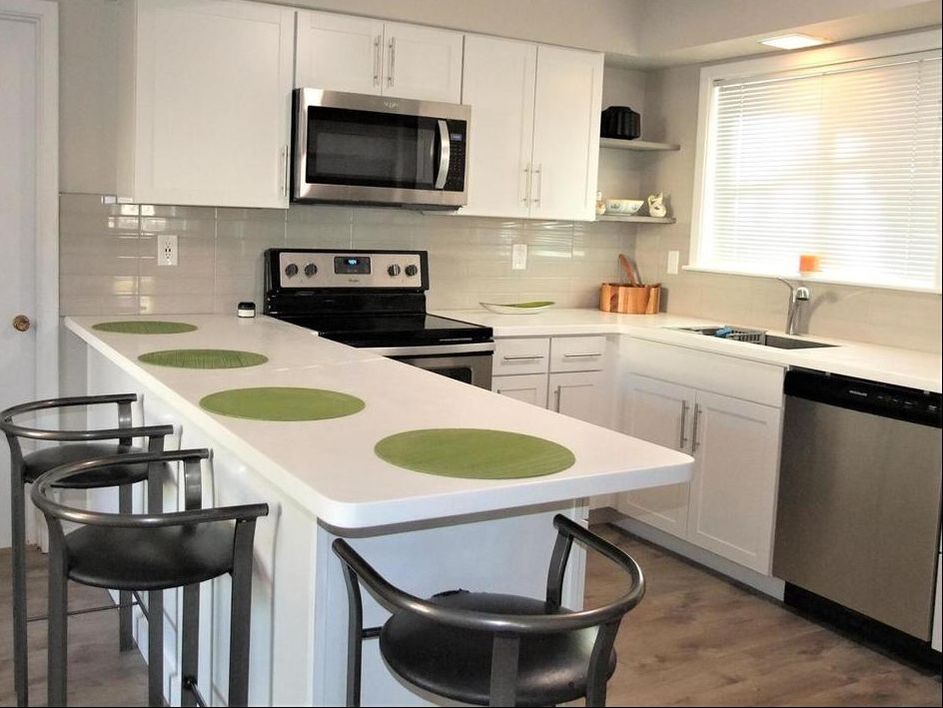    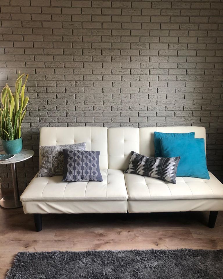 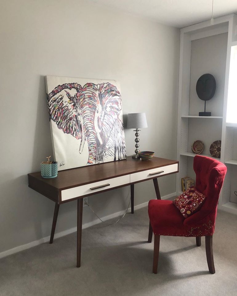 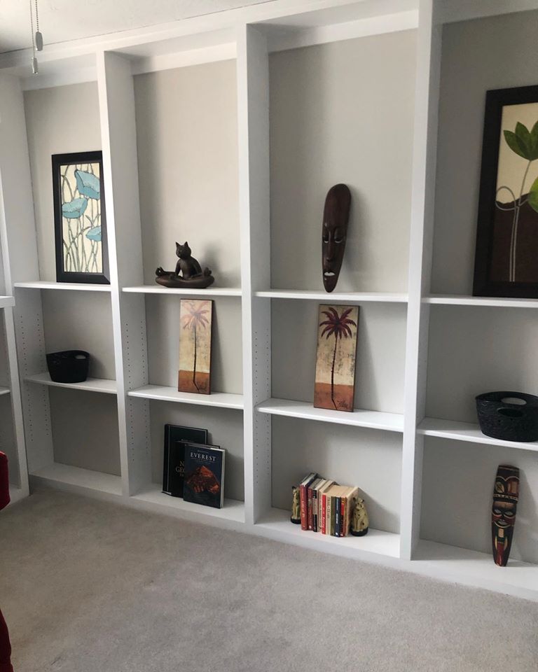 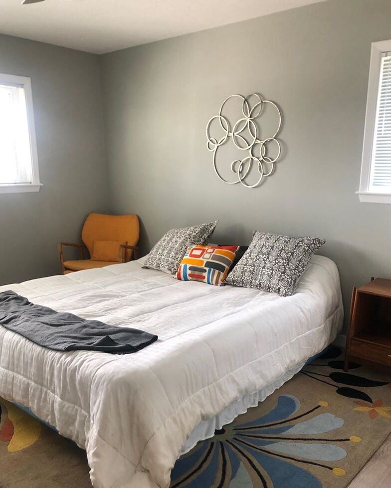 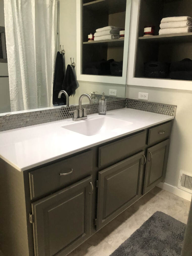 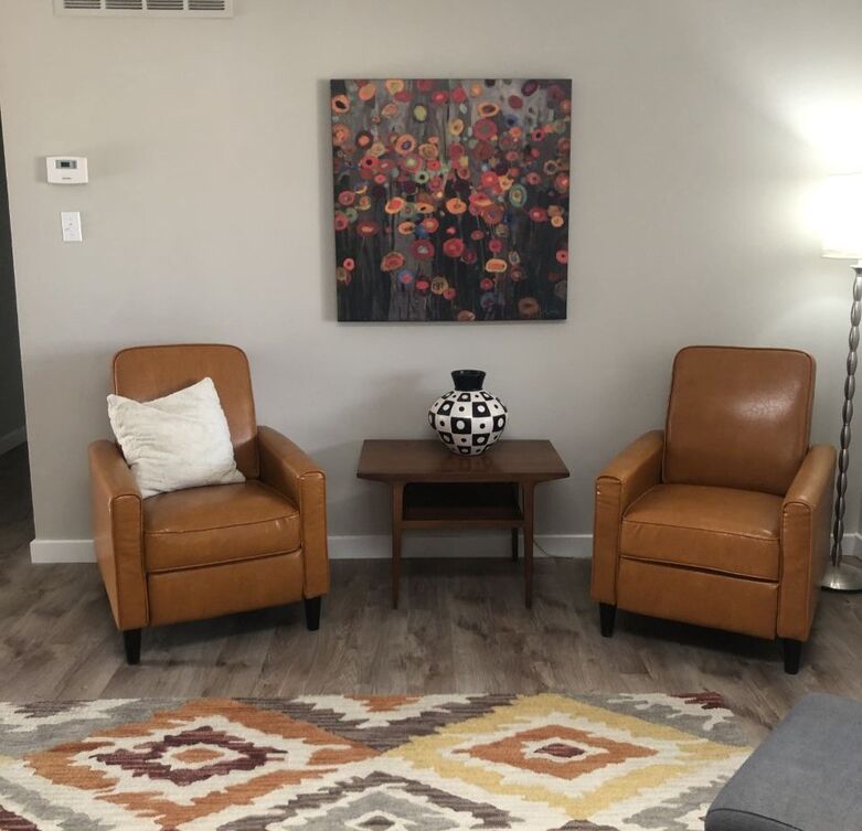 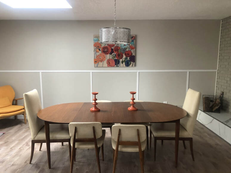 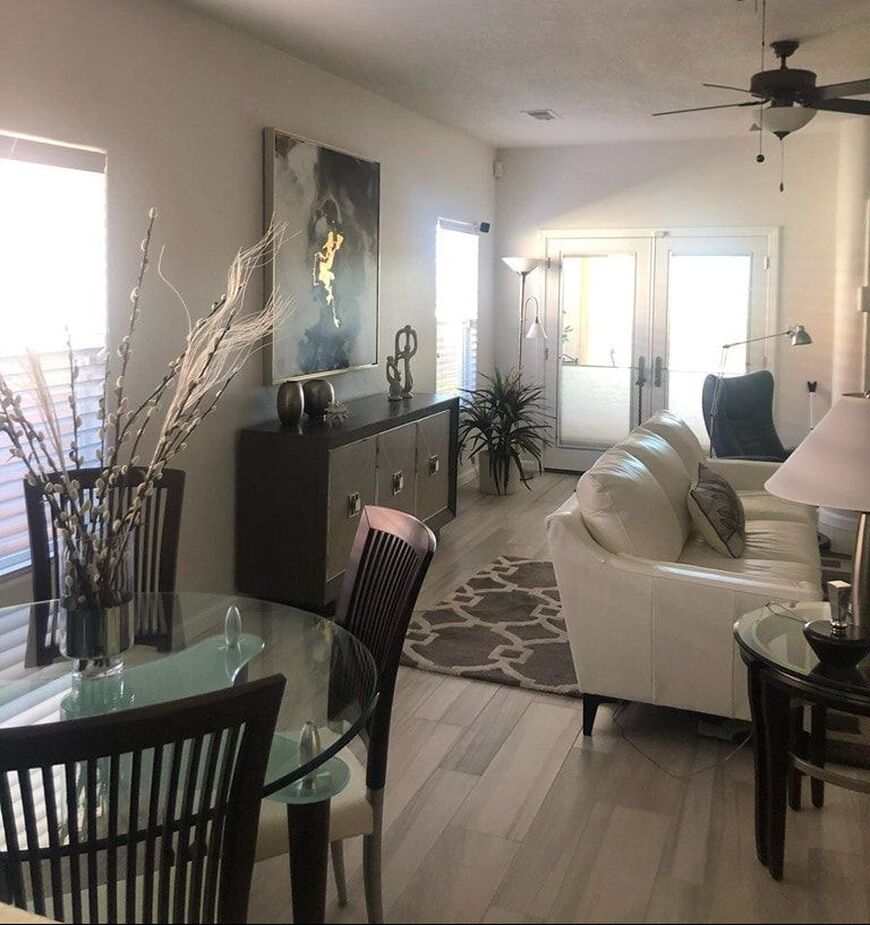  I’ve been choosing a lot of whites recently which has me so excited!This recent color and redesign project is almost complete, other than waiting on a new white leather couch and chair. I get asked a lot about what are the best whites simply due to the various undertones and overkill of what seems like hundreds of shades to choose from. She, like many of my do it yourself clients, had several white squares painted on her walls (see before photo below) which most times only serves to confuse more as the color is skewed by the existing, surrounding color. This is what led her to ask around and ultimately be referred to me. When I visited her she had already selected a couch from Tema so she had the white leather swatch to show me. Based on her the swatch, her flooring, her lighting and what she wanted, I specified Sherwin Williams Snowbound for the walls which is a very clean white but not a stark blueish white. We still wanted a slight contrast between the walls and the baseboard and doors so I chose High Reflective White- one of the purest, brightest whites Sherwin Williams has with a lovely undertone. I also specified a different sheen from the walls. She wanted to keep an accent wall so I suggested we change the wall to a different wall than her original accent wall. I chose the selected wall for several reasons: 1. It’s an open floor plan in the entry way, living room and dining room. The wall I chose is next to her dining table so it gives the feeling of a separate section. 2. When you enter into the living room from the entry way you see only white walls so it’s sleek and her artwork is the main focus. 3. Anytime I do an accent wall the question is, is there something to accentuate? The original purple accent wall didn’t need to be accentuated. 4. The additional purple wall around the back door was on the same plain as the fireplace wall and at one time had been a corner that was a small reading nook. Without that nook it served no purpose as an accent wall. As a matter of fact it chopped up the look and drew your eye away from the fireplace and brought attention to the outside door instead. She wanted a blue accent this time so I spec’d a beautiful, elegant blue from Sherwin Williams called Granite Peak. She ordered a blue chair from Tema. Phase 1- She did bot hire a professional painter so I specified the type of paint to buy. She and a friend and a handyman did ALL the painting. Phase 2- She and I went shopping for furniture and artwork. (The current after pictures shown are the white leather furniture but when it came in she felt it was uncomfortable so she will be returning it.) We found a beautiful and comfortable white leather tufted couch and chair which are now on order from Tema. The artwork and buffet are from Ethan Allen. I love “shopping” in other rooms to find the perfect accessories while keeping on budget -so the metal artwork I took from her hallway and switched up with some other artwork from her office. Lastly, the metal vases and off-white statues on the buffet were regrouped. More photos to come when the new furniture comes in!   Before Photos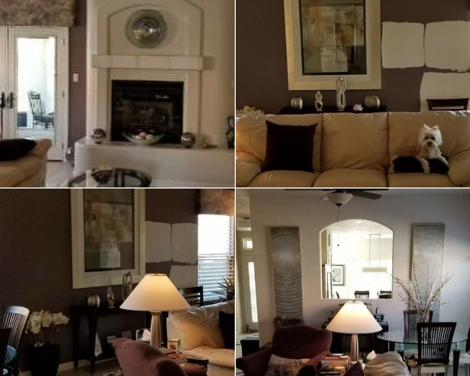 In the third of a three-part series, we are sharing some photos of some of the more popular grays and how different they can look according to the lighting and what surrounds them, like other walls, counter-tops, furniture and flooring. (Disclaimer- unless otherwise noted these are our own amateur iPhone photos from our jobs. We are great at choosing colors and painting, not necessarily photography!)  Sherwin Williams Argos (Photo credit Calvary Albuquerque)     Sherwin Williams Argos   Sherwin Williams Mindful Gray  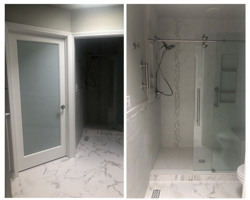  Sherwin Williams Aloof Gray    Sherwin Williams Modern Gray  Sherwin Williams Skyline Steel The next two colors are actually more of a greige than gray.  Sherwin Williams Shiitake  Sherwin Williams Megagreige
In the second of a two part series, we are sharing some photos of some of the more popular grays and how different they can look according to the lighting and what surrounds them, like other walls, counter-tops, furniture and flooring. (Disclaimer- these are our own amateur iPhone photos.) 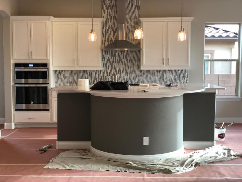 Gauntlet Gray  Shown here: Anew Gray, Keystone Gray and Warm Stone  Drift of Mist and Modern Gray (Wall in reflection is Parisian Patina)  Gauntlet Gray  Agreeable Gray (ceiling Gale Force)  Anew Gray  Anew Gray  Agreeable Gray (Ceiling Brainstorm Bronze) 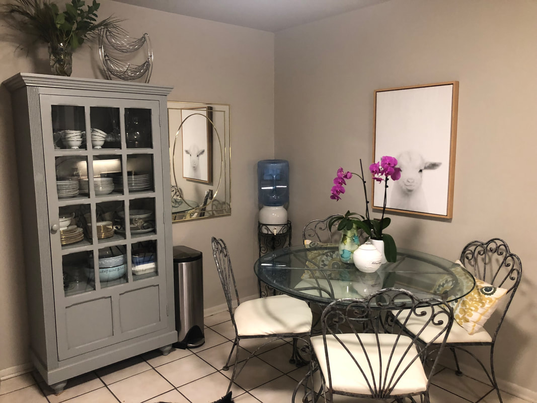 Skyline Steel (Cabinet Gris)  Mindful Gray and Gauntlet Gray  Chelsea Gray and Anonymous  Intellectual Gray 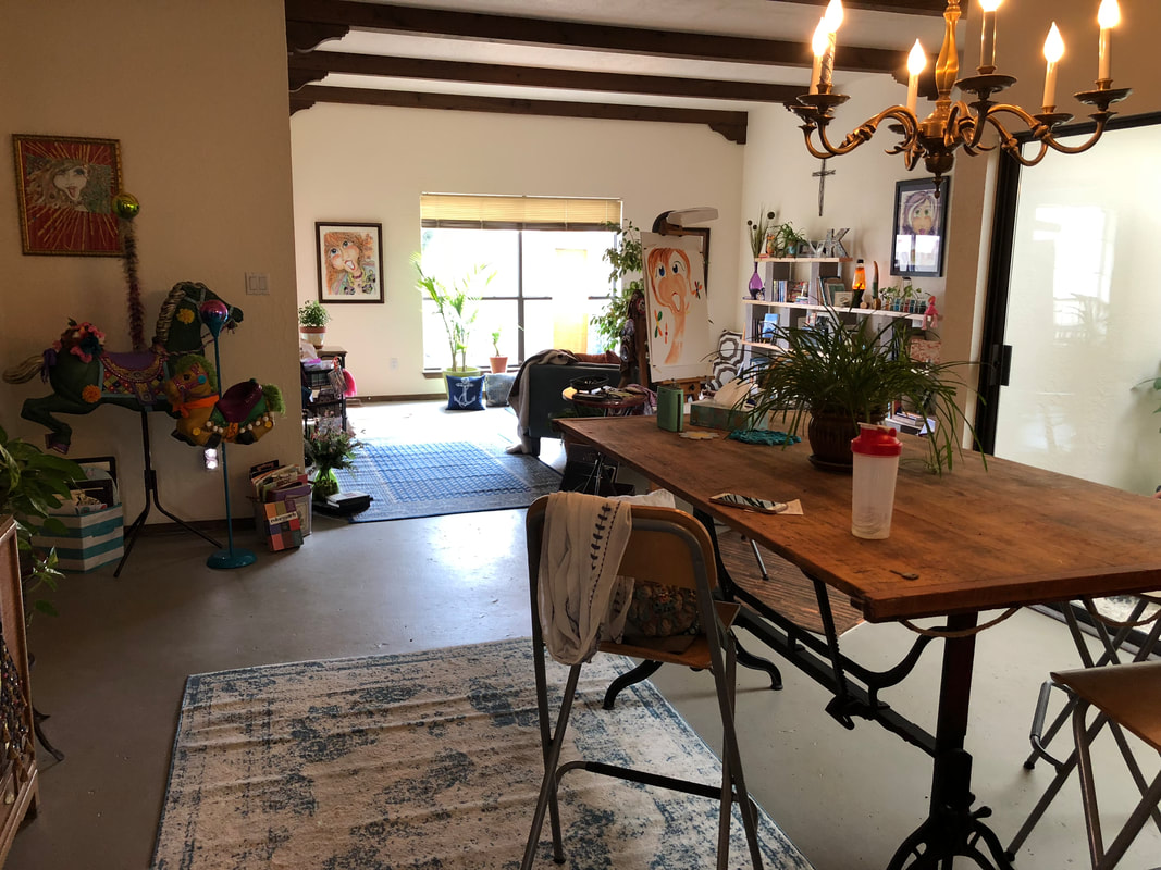 Floor- Felted Wool  Modern Gray  Aloof Gray  Dovetail  Gris  Warm Stone  Modern Gray Anonymous Gray 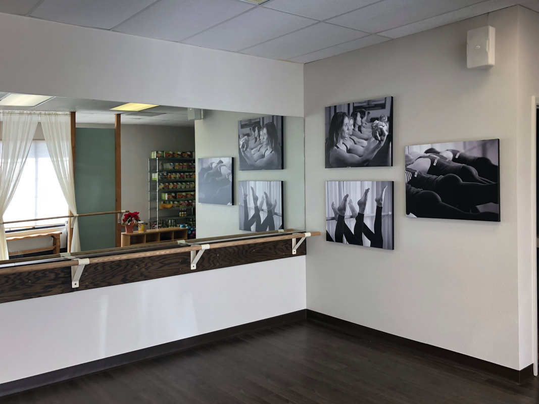 Agreeable Gray  Skyline Steel If you need help choosing the perfect gray and/or the perfect light bulbs for your space, contact me.
During a color consultation I look at your fixed elements and choose the right color(s), lightbulbs and sheen according to undertones, temperature, and light reflective value (LRV). I work with Sherwin Williams, Benjamin Moore and Dunn Edwards paints. 2019 Colors of the Year Each year our favorite paint companies release their color of the year. Keep scrolling to see the predictions for 2019! 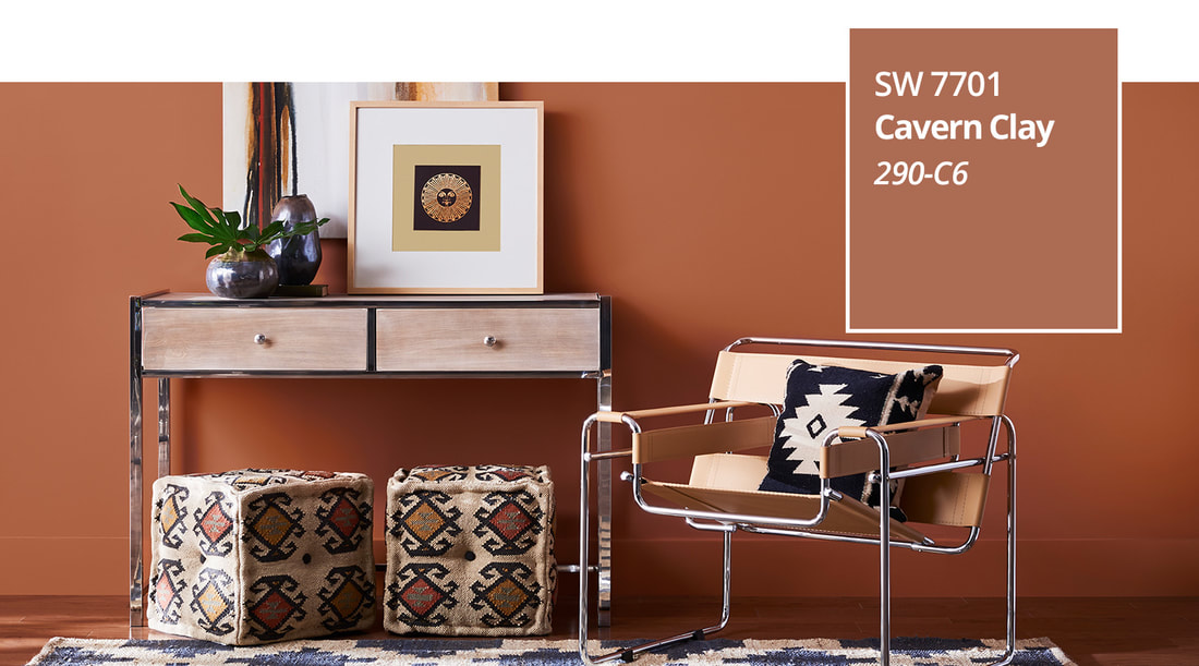 Sherwin Williams CAVERN CLAY "A warm terracotta color with ancient, elemental roots, Cavern Clay, is Sherwin Williams 2019 Color of the Year. Cavern Clay is a nod to midcentury modern style, but with the soul of the American Southwest, which together creates a desert modern aesthetic. This warm, earthy hue is both casual and refined. It can be the backdrop of a playful, welcoming dining room or kitchen when paired with bright tiles, warm stone and sculptural greenery. Complementary materials include leather, simple woodgrains and indigenous cacti in contemporary, sleek gardening planters. Cavern Clay is an easy way to bring the warmth of the outdoors in. Envision beaches, canyons and deserts, and sun-washed late summer afternoons-all of this embodied in one color." Sherwin Williams  Benjamin Moore METROPOLITAN "Calm, composed and effortlessly sophisticated, Benjamin Moore's Color of the Year 2019, Metropolitan, exudes glamour, beauty and balance." "Metropolitan AF-690 emanates nuance, harmony and extravagant ease. Always adaptable, it softens to matte or shimmers with sheen. It's neutral. It's understated. It just is. This is color, off-duty." -Ellen O'Neill, Benjamin Moore & Co.  Dunn Edwards SPICE OF LIFE "Dunn-Edwards 2019 Color of the Year, Spice of Life , is inspired by a celebration of what makes life interesting and exciting. It's warm, inviting, adventurous and life-affirming. This strong, enticing, spice-market blend adds a complex, flavorful seasoning to design palettes. The elements of orange in the hue give a grounded, substantial feeling to design. This strong, full-bodied and intense hue, full of passion and life, can look organic and natural or appear moody and sophisticated. In its organic and natural world, Spice of Life represents a colorful expression inspired by global crafts. When playing subtle and stylish, this lush, refined hue is eternal - historic, yet youthful." Dunn-Edwards  Pantone
LIVING CORAL "Vibrant, yet mellow Living Coral embraces us with warmth and nourishment to provide comfort and buoyancy in our continually shifting environment. In reaction to the onslaught of digital technology and social media increasingly embedding into daily life, we are seeking authentic and immersive experiences that enable connection and intimacy. Sociable and spirited, the engaging nature of Living Coral welcomes and encourages lighthearted activity. Symbolizing our innate need for optimism and joyful pursuits, Living Coral embodies our desire for playful expression. Representing the fusion of modern life, PANTONE Living Coral is a nurturing color that appears in our natural surroundings and at the same time, displays a lively presence within social media." Pantone Whether you love it or hate it, you can't ignore that gray is one of the most popular colors in home decor today. If the trend is on it's way out, New Mexico hasn't gotten the memo yet.I still get many calls from people who are looking for the perfect gray. There are many shades of gray, some warm, some cool and the average homeowner, if not skilled at seeing undertones and understanding lighting, can end up with blue walls, green walls or purple walls. That's where I come in; many people need help before they invest the money and paint the wrong color. In the first of a two part series, I want to share some photos of some of the more popular grays and how different they can look according to what surrounds them, the fixed elements- like other walls, countertops, furniture and flooring- as well as lighting. (Disclaimer- these are my own amateur iPhone photos, so color is not as accurate.) The following two photos are Anew Gray from Sherwin Williams on the walls and ceilings in the same home. 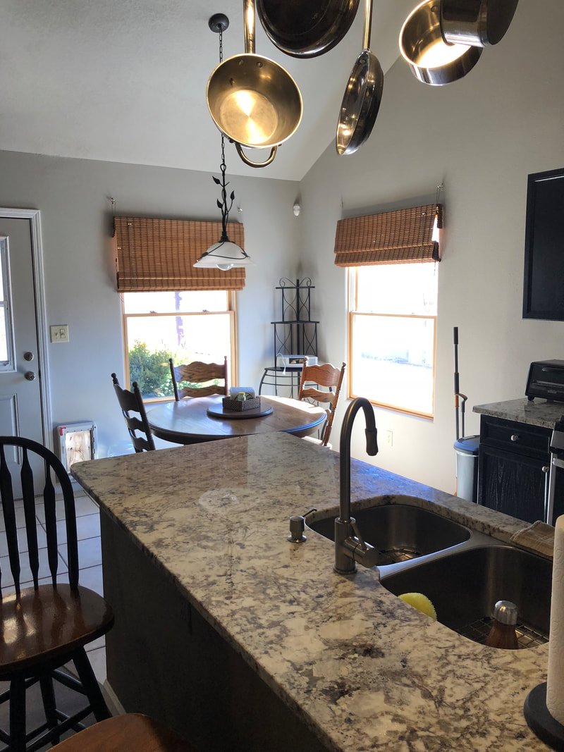 Anew Gray  Anew Gray This dramatic staircase is Anonymous Gray.  Anonymous Gray Staircase These pictures of Agreeable Gray are at the same fitness studio- just a different amount of natural light shining on some of the walls.  Agreeable Gray 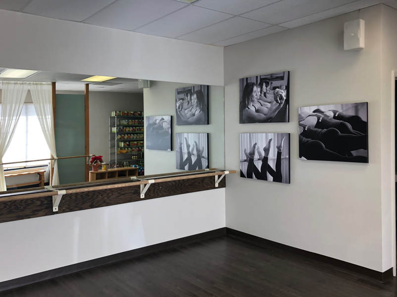 Agreeable Gray Not entirely gray, Balanced Beige is more of a greige. But for this homeowner, with the warmth of the fixed elements, this was their perfect gray. In the second photo (different house) the lighting shows a bit more of the beige while still retaining a slight grayish tone.  Balanced Beige  Balanced Beige These photos are from two different homes. They are all Dorian Gray.  Dorian Gray 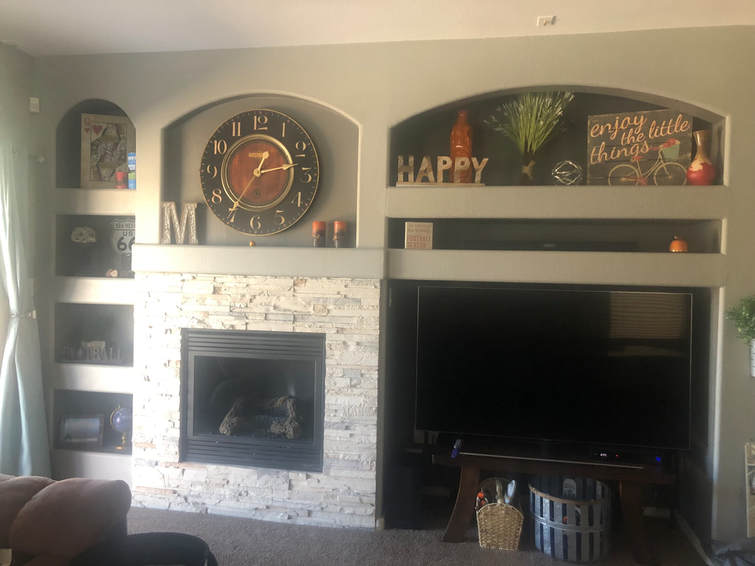 Dorian Gray with accent color Gauntlet Gray  Dorian Gray  Dorian Gray Stay tuned for Part 2, coming soon! If you need help choosing your color palette, give me a call!
|
Author
Jennifer Smith is a Certified Architectural Color Consultant in Albuquerque, NM. Archives
November 2023
Categories
|


 RSS Feed